
Carnival Treasures
by Ruth Eaves
Issue 311 - March 1999
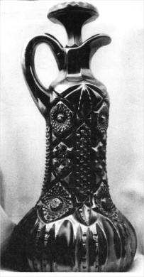
The photo shown is the "Near Cut" decanter made by the Cambridge
Glass Company in Cambridge, Ohio between 1910 and 1920. It is dark
green with gold, blue, and red highlights in the irridescence. The
decanter stands 12 inches tall and is quite heavy, it is the perfect
one of the two known.
 This piece is another treasure from the Woody and
Marlene Funk collection. They purchased the piece at the Ed Garner
Auction in 1983.
This piece is another treasure from the Woody and
Marlene Funk collection. They purchased the piece at the Ed Garner
Auction in 1983.
I must say thank you to Bud and Anna Walker, Cambridge Glass collectors from South Jersey, for providing me with information on the Cambridge decanters. They shared a reprinted catalog called "Near Cut" from 1910. In the book there was a page from design #2666. This decanter was shown on that page. The design was not given a name. No color was mentioned in the catalog. The Cambridge Company used the words "Nearcut" for many designs they created, including Wheat Sheaf. When carnival collectors say "near cut decanter" we probably think of this piece. A Cambridge collector would need us to be more specific, as many "near cut" designs can be seen in the 1910 catalog.
I was interested to learn the Cambridge Company was the second company to iridize glass. Fenton was the first, then Cambridge and Northwood, only months after Fenton. The unanswered question is, why did Cambridge iridize so little? We know this decanter and the Wheat Sheaf, and then the Buzz Saw cruets and a cologne in the "near cut" designs were made with iridescence. The Inverted Strawberry and Inverted Feather were two other patterns iridized. After seeing other examples of glass by Cambridge, my guess is that since the company chose to do so many other varied treatments of glass, iridizing wasn't that important. They evidently did not meet with the financial success Fenton and Northwood did with iridescence.
This decanter was also made using the "cut shut" mould I described in my last article.